http://kelseyherritt.blogspot.com/2011/04/triangular-plot.html
A triangular plot is able to represent three different variables.
Thursday, April 17, 2014
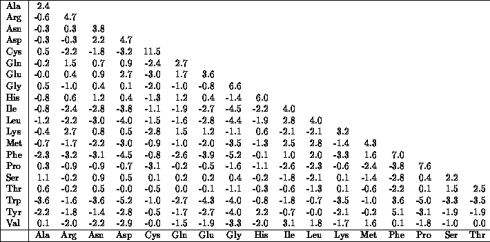
similarity matrix
http://mendel.ethz.ch:8080/Server/ServerBooklet/section2_14.html
A similarity matrix is a representation of scores that shows the similarity between numerous data points.
Histogram
http://codereview.stackexchange.com/questions/36266/building-an-histogram-array-in-php
A histogram is a chart that uses bars to measure statistics.this histograms shows the ranges of population.
Steam and leaf plot
A stem and leaf plot is a special table where the stem represents the beginning number and the leaf if the ending number who changes the entire number. This plot here shows
Box Plot
This box plot shows the vistors time for each individual. The black dot shows the median visit times
scatterplot
http://onlinestatbook.com/chapter4/intro.html
A scatterplt is a mathamatical diagram that represents two varaibles. thus particular one shows a wife's age as a function of her husband's age.
A scatterplt is a mathamatical diagram that represents two varaibles. thus particular one shows a wife's age as a function of her husband's age.
Star Plot
A star plot is a method of displaying multivariated data. Also each star represents a single observation. and in the map above it shows a comparison of crime rates in cities in the U.S.
Cartogram map
Cartogram maps represents quantitive densities of an area.
statistical map
This is a stistical map because it shows ststistical information about the U.S. This maps shows decreases and increases in income throughout the U.S
Proportional circle maps
This is a map of califonia motor vehicle deaths using a proportional circle map. The larger the orange circles are the more deaths that have accured in that region.
Choropleth map
This Choropleth map shows the population per square mile. The shading show the relative distribution of population in each state.
Dot distribution map
This is a dot distribution mab of the Election votes in 1992. Dot maps shows spatial patterns relying on visual scatter.
PLSS Map
The PLSS(public land and survey system) is a way of decribing and subdividing land in the US. The map above is of harrison county, iowa; its basically describing the ownership of land throughout the county.
Cadastral maps
Cadastral maps shows boundaries and seperation of parcels. The maps are used in real estate ad gives percise location and dementions of an area.
Thematic Map
Thematic maps are maps or charts focused on a specific theme. The theme that this map focuses on is woody vegetation decrese in different regions. Its shows how much vegetation was decreased in each region.
Flow Map
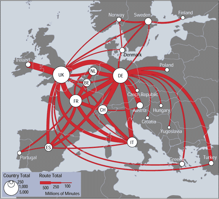
This is a example of a trafic flow map from different country's. The thickness of the red line shows the volume of traffic that goes in and out of a country.
Isobars Map
This isobar map is used connecting points of equal atomospheric pressure. Typically found on a weather map.
isotach Map

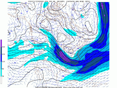
This is an example of a isotach map. It shows the lines on a suface connecting equal wind speed. It is use to show others of expected wind speeds throughout a day or even during a storm.
Isopach Map
http://www.earthbyte.org/Resources/ICONS/SAM/ParanaBasin/pdf/SAM.ParanaBasin.mobilisopachs.2m.pdf
This is a map of the parana basin showing the thickness of the sediment. And from this map you could see that the thickest parts are in the middle which are the light color shadings.
Isohyets Map
Isohyets maps typically show the average amount of rainfall in an area. This is an isohyets map of south africa and is mean annual rainfall in mm. Is does a great job of giving map readers an idea of how much rain south africa gets each year using different colors. I chose south africa because I know there are many areas that do not recieve much rain amd barely have water.
Topogrphic Map
This is a example of a Topographic map with contour lines to help demostrate elevation. This map help firefights to see diretions in which a fire would spread using moutain tops.
Mental Map
http://www.freakingnews.com/American-Map-Melting-Pot-Pics-72362.asp
This is a mental map of the United States. Its is a great example of how one sees the U.S today. It shows that many people from all over the world has moved into the U.S, this is the main reason it is know as the Melting pot. Despite the differences in culture there is a great opurtuntiy for everyone to move here together. It also shows areas where the majority of different ethnic background prefer to live
Hypsometric map
http://www.shadedrelief.com/physical/
This is a Hypsometric map of the United States. It is three dementional map showing relief using different colors (from green to brown) showing how himid or dry the region is. You could also see the raised reliefs where mountains are located.
Planimetric Mapping
This is a nap of Tallahassee, Florida. It is considered to be a form of planimetric mapping because he map is two dimensional and gives the reader a great picture of tallahasses and is major highways. Also there are no contours or relief features in this map.
Subscribe to:
Comments (Atom)


